Welcome to the
Firefly design system
Our brand is not just our logo or colors, but how we are represented in every interaction we have with our audiences.
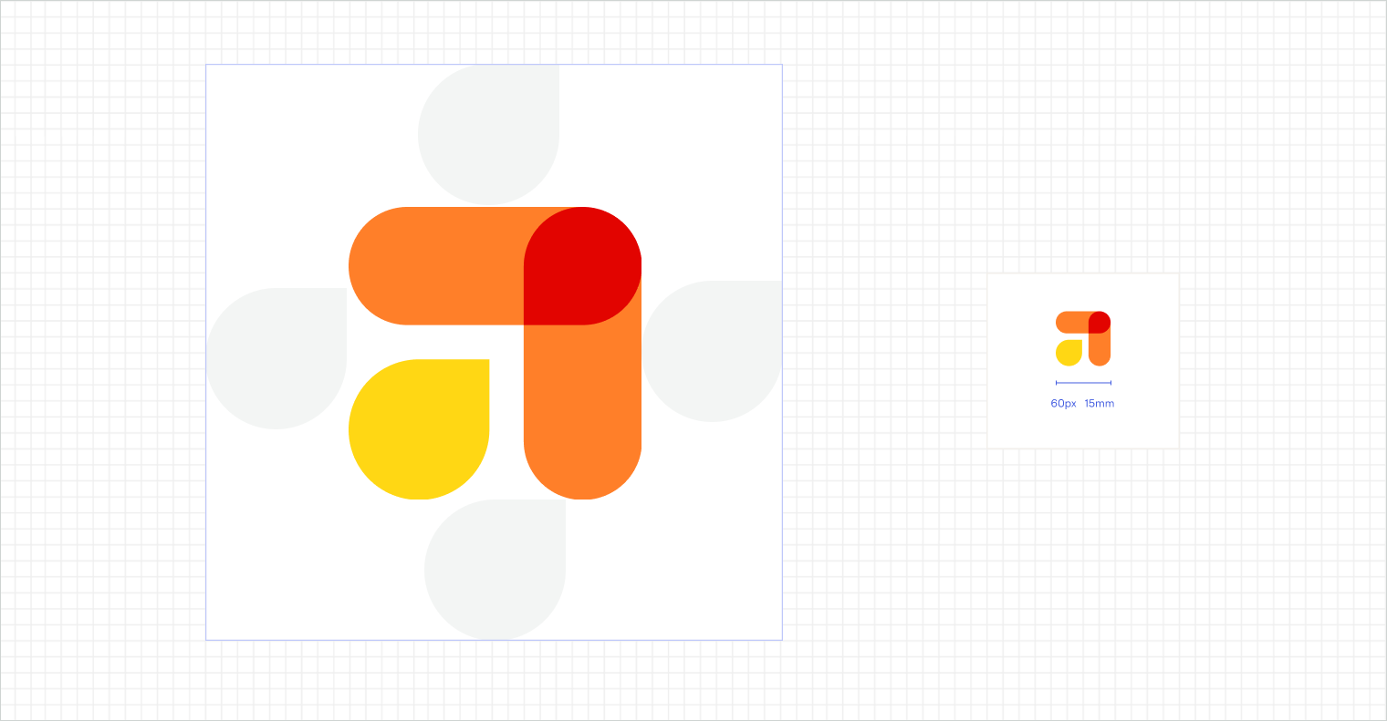
Logo
Guidance for how to use the logo at small scales and in composition with other elements.
Logo Misuse
Examples of common way the logo is misused.

Busy Background
Do not use over a busy image with a low contrast color

Logo Mask
Do not use logo as layer mask.

Logo With Non-Brand Colors
Do not use logo over non-brand colors.

Logo Color Changes
Do not change logo colors.

Logo Position and Margin Rules
Do not ignore logo positioning and margin rules.

Logo Rotation
Do not rotate the logo to anything that is not 0°.

Logo With Shadow and Stroke
Do not add a shadow or stroke to the logo.

Stretched Logo
Do not stretch the logo vertically or horizontally.
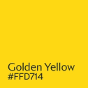
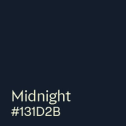
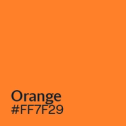
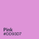
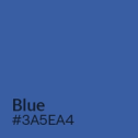
Primary Color Palette
Primary Brand Colors and Hex Codes.

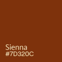
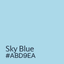
Secondary Color Palette
Richly saturated secondary hues, inspired by the natural world, can be expressed through illustration, iconography, and other spot treatments that don’t involve text.
Don’t use secondary hues for text colors. Don’t set any text on secondary hues as backgrounds.


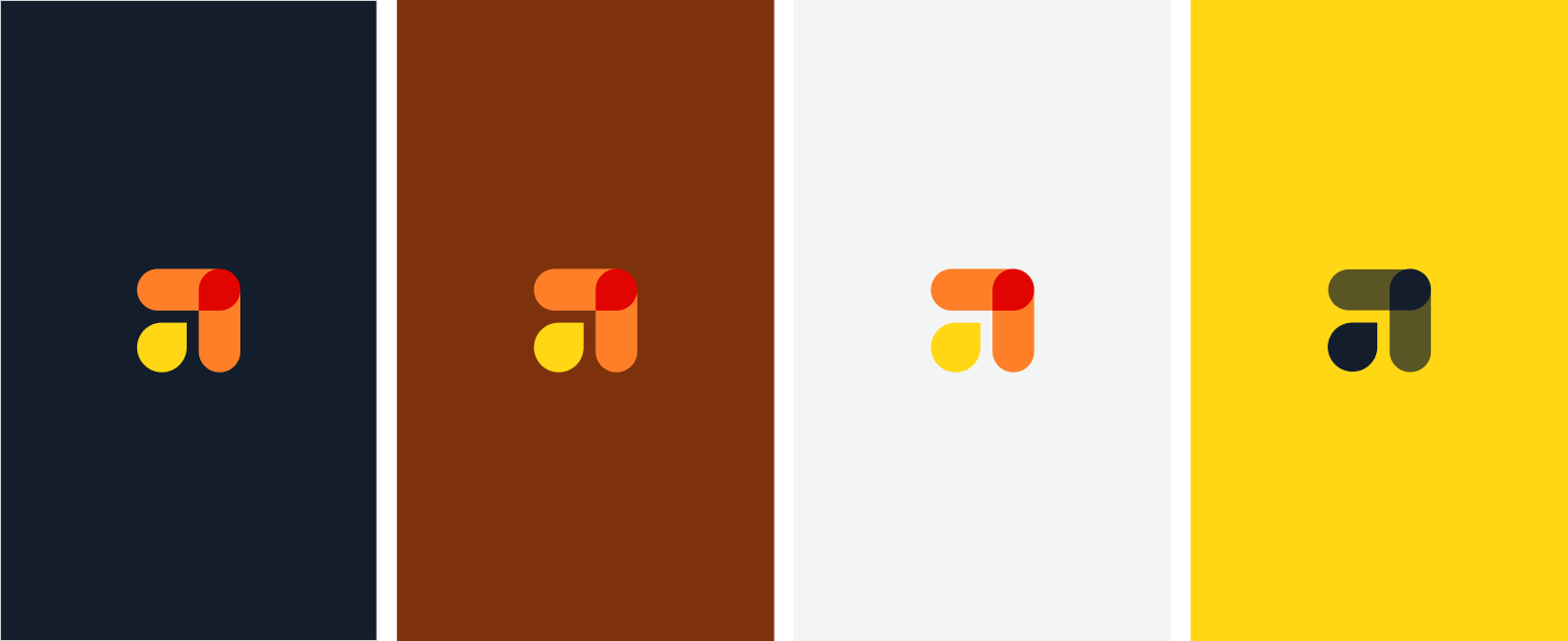
Color Pairings
Use the key below to understand how our brand colors work on various background colors


Typefaces
All Headlines should be set in Trust Medium 1A.
Graphic Elements
Iconography
Overlapping Elements

Overlapping
Inspired by the Firefly logo, we use a system of blended overlaps to create continuous connections between elements. Below are some guidelines that promote consistency across applications.
Overlapping Similar Images
Overlapping similar images (like headshots) in a consistent, snaking pattern.

Photography
Use photographs of people depicting them in situational, everyday environments. Avoid scenes that feel consciously staged, and avoid portraits that show people styled in ways that are not true to their daily lives.
Treat photography with a warm tone.


Glow Treatment
- Use the light-yellow Glow color to create the effect on images with a lighter tone.
- Use the Golden Yellow color to create the effect on images with a darker tone.


Brand Asset Downloads
This section provides downloads for all essential brand assets. Refer to this page or reach out for guidance if needed.